

How light affects color perception and its impact on visual comfort and safety in public spaces
ARRE —30/5/2025— Light quality is not defined solely by intensity or color. There's a third factor—often underestimated—that shapes how we perceive our surroundings: the Color Rendering Index (CRI), known in Spanish as Índice de Reproducción Cromática (IRC). This fourth issue of Campus ATP explores its importance.
What is CRI?
The CRI is a value from 0 to 100 that indicates how faithfully a light source renders colors compared to a natural reference. The higher the CRI, the more realistic the color perception. Low CRI distorts hues, while high CRI preserves them accurately in illuminated areas.
How is CRI measured?
CRI is measured by illuminating a standard set of color samples with the test light and comparing how they appear under an ideal reference source—either daylight or a blackbody radiator, depending on the correlated color temperature (CCT). The average of the perceived color differences across the samples determines the final CRI value.
It’s worth noting that CRI doesn’t measure the complete spectral curve of a light source, but rather its perceptual effect. It offers a simplified but effective way to express visual accuracy.
|
CRI Value |
Color Rendering Quality |
|
90 – 100 |
Excellent – similar to natural daylight |
|
80 – 89 |
Good – suitable for most applications |
|
70 – 79 |
Acceptable – with some limitations |
|
< 70 |
Poor – noticeable color distortion |
Beyond interiors: CRI in public lighting
For years, CRI was associated almost exclusively with indoor environments where color accuracy is critical, such as retail, healthcare, or art spaces. However, in outdoor lighting it also plays a key role.
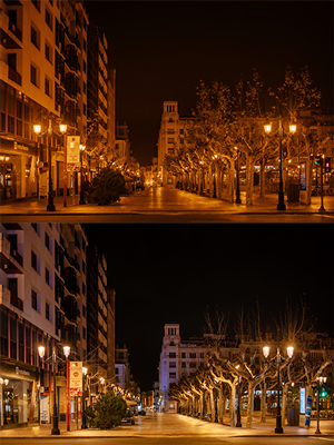
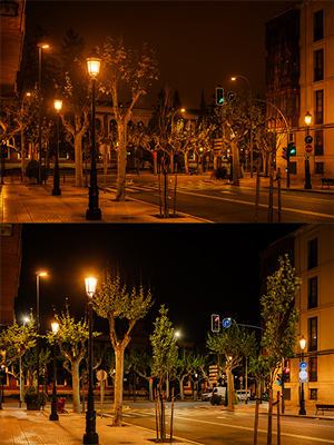
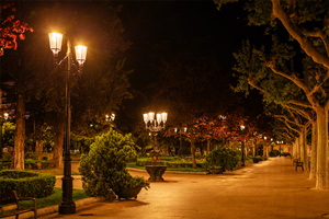
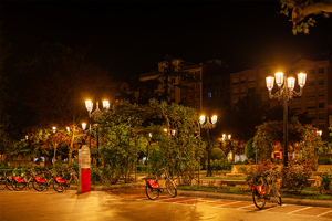
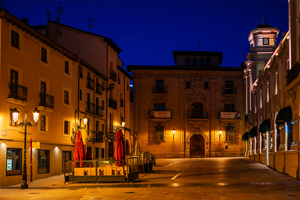
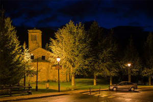
Accurate color rendering improves visual perception, helps identify people, vehicles, and signs, and enhances the feeling of safety in public spaces. It also contributes to aesthetic comfort: warm, well-balanced lighting creates more pleasant, inviting, and harmonious environments.
In pedestrian zones, natural areas, and rural settings, the balance between color temperature and CRI becomes a key factor in visual well-being.
A resolved dilemma: CRI vs. color temperature
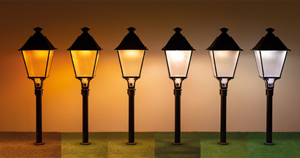
For a long time, choosing warm light meant sacrificing color quality. Technologies like high-pressure sodium (HPS), with their characteristic amber tone, offered extremely low CRI. In contrast, white light sources delivered better color fidelity but lacked visual warmth.
Today, that trade-off is no longer necessary. Advances in LED technology now allow for ultra-warm color temperatures—like 2200 K or even 1800 K—to be paired with CRI levels far superior to HPS.
|
Source |
CCT (K) |
Approximate CRI |
|
HPS (sodium) |
1800 |
25 |
|
ATP LED 2200 K |
2200 |
>70 |
|
ATP LED 1800 K |
1800 |
>70 |
|
PC Amber (LED) |
—* |
58 |
|
Metal halide (HM) |
2800 |
88 |
*Unlike white LEDs, PC Amber does not have a true correlated color temperature (CCT). Its spectrum is concentrated in the amber-red range and lacks blue and green components. This results in a very warm visual tone, but also a lower color rendering index (CRI), typically around 58.
ATP’s LED range offers a wide variety of ultra-warm CCT options with CRI values above 70, representing a significant improvement over older technologies. In practice, this means enjoying warm, comfortable atmospheres without compromising visual clarity and fidelity.
Same color temperature = same light?
It is often assumed that two light sources with the same correlated color temperature (CCT) produce the same visual quality. But that isn’t true. CCT describes the perceived color of the light, not its spectral richness.
For instance, both a high-pressure sodium (HPS) lamp and a modern LED can emit light at 1800 K. However, HPS emits almost all of its energy in a narrow band of yellow-amber wavelengths. This severely limits its ability to render other colors, resulting in very low CRI.
In contrast, next-generation LEDs offer broader spectra, even at warm CCTs, enabling CRI levels above 70 at temperatures once thought incompatible with accurate color rendering.
In other words, the color we perceive and the quality with which we see the world are not the same. CCT gives us a general visual impression; CRI tells us how true to life that impression really is.
Technology that enhances perception
ATP luminaires integrate high-performance LEDs and optical designs that ensure consistent, controlled color rendering. The technical documentation for each model includes real CRI values for every CCT, along with detailed spectral radiance data, including the exact percentage of blue light emission.
In summary, CRI is more than a number. It’s a guarantee of visual quality. Thanks to LED technology, we can now create outdoor environments that are warm, safe, and emotionally pleasing—without sacrificing color fidelity.
In the next issue of ATP Campus we’ll explore color temperature in depth: what it really means, how it's measured, and how it shapes visual and emotional perception.
Press contact:
Nicolás Cancio
ATP Lighting
comunicacion@atpiluminacion.com
Copyright © 2016 ATP Lighting Inc. All rights reserved. ATP Lighting, the ATP Lighting logo and all trade names listed on this website with the ® symbol are registered trademarks of ATP Lighting.


![[...]](https://www.atpiluminacion.com/xtra/imgs/loading.gif)